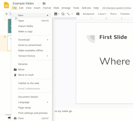
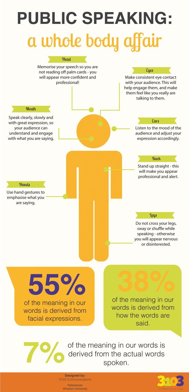
Create a Better Presentation
Your slide presentation should look more like a poster than a handout.
Your slides should:
Your slides should:
- reinforce the points in your speech
- include just a few words, at most, on each slide
- use images, when appropriate, to enhance your message
- be easy to read from the back of the room
Organize Your Information Ahead of Time
|
Put the information from your notes into a logical order based on your assignment requirements and what you want to communicate to your audience. Need to show the history of your topic, to describe it, show how to solve or show causes and effects of a problem or compare and contrast two things?
Try using a graphic organizer to think it through first. |

|
Themes & Backgrounds
Most Google Slides and PowerPoint themes are created by professional graphic designers. They are usually a better option than creating your own.
If you use the built-in themes, stick to the fonts and colors included in the theme.
SlidesCarnival and SlidesGo have some other free Google Slides templates as well.
If you use the built-in themes, stick to the fonts and colors included in the theme.
SlidesCarnival and SlidesGo have some other free Google Slides templates as well.
If you choose to create your own theme:
- pick two main colors -- one for the background, another for text
- a white background and black text is your best option
- a dark background is okay, but make sure to use very light color text
- use the same colors, fonts and other elements across all slides
Text
|
Like a billboard on the highway, text on slides should be short and easy to process right away.
Slide Text Guidelines:
|
|
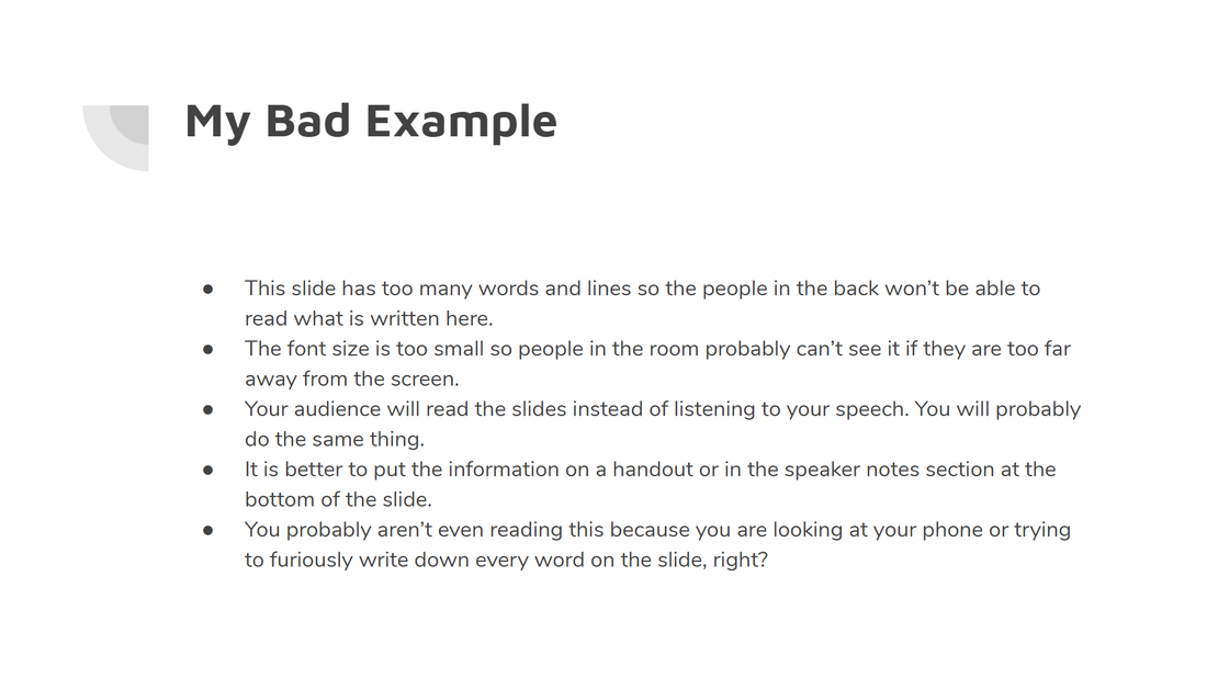
Avoid lines of text with bullet points if you can. Most of this information should be said by the presenter, not read by the audience. The text is too small and there are too many words.
|
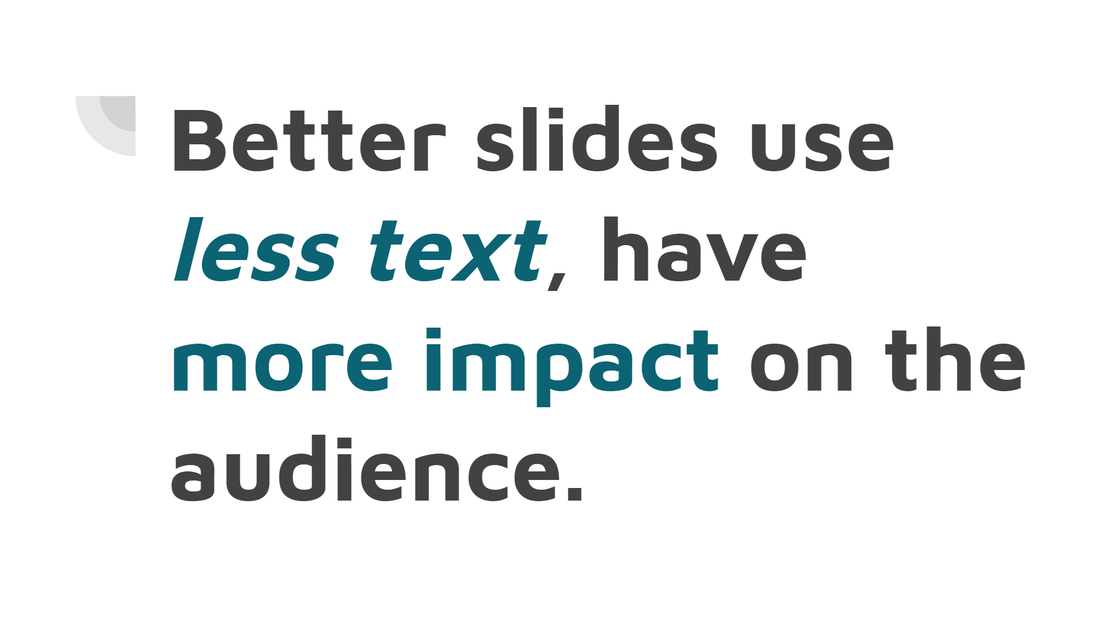
This slide has just the main idea in just one sentence in large letters. The presenter can fill in the details verbally or with a handout provided to the audience.
|
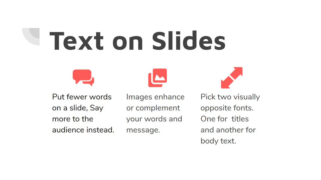
This example has the main idea at the top and three supporting details. The icons help to reinforce the meaning of each detail.
|
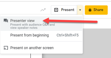
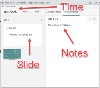
Speaker Notes
Move most of the text to the Speaker Notes section under the slide.You can print out the slides in notes view and use them when presenting.
If you have a computer in front of you while presenting to the audience, you can also use Presenter View so that the current slide, a presentation timer, and your notes are on your screen.
|
|
Images
Eye catching photographic, icons, or infographics, along with short text can really enhance your audience’s understand much more than just your verbal explanation.
Be careful when choosing graphics for your presentation. Choose slide images related to the content (not just cute or distracting) to reinforce your message.
Limit the number of images to 1 or 2 per slide.
Enlarge the image so that all of your audience can see it. Fill half or the whole slide.
If you add text over the photo, make sure you use a color that makes it easy to read the text.
Do not use slide animations (e.g. flying text and makes noises) unless you have a really good reason.
There are (maybe) one or two good reasons. Just don’t do it.
There are plenty of places to get high quality photos, icons, and other graphics.
icons: Flaticon, Noun Project
photos & graphics: Unsplach, Pixabay
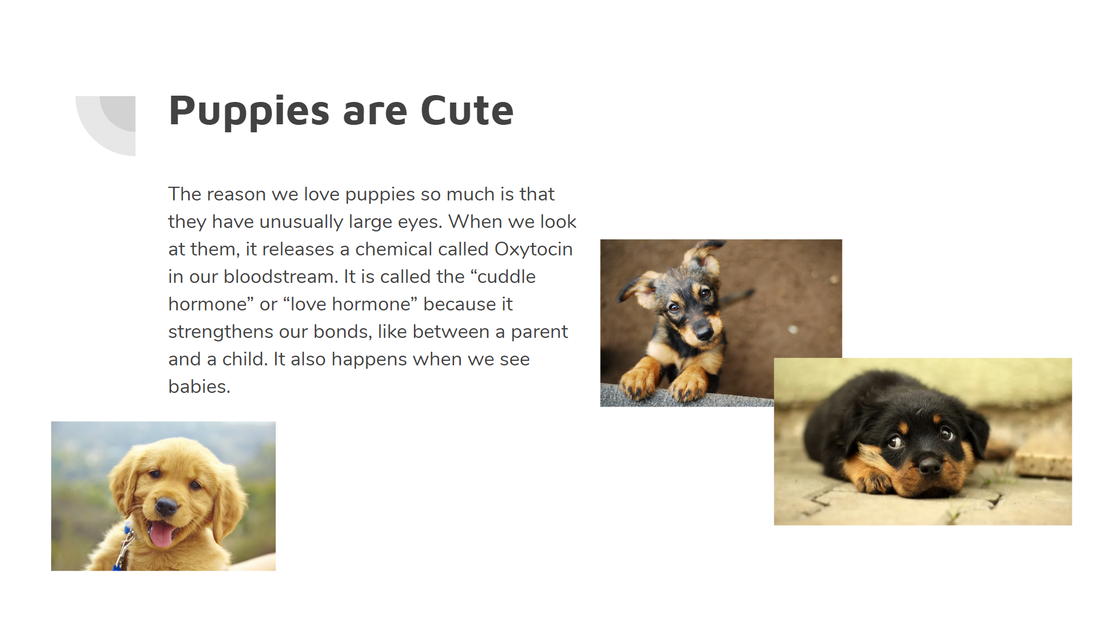
These puppies may be cute, but the pictures are too small and an audience member won't know where to focus. Plus, there is too much text on the screen.
|

Increasing the size of the picture and adding a question related to your presentation gets your point across. The picture and question are obviously connected now.
|

Another option is to have a picture fill up the whole screen. A single word on the screen connects the topic with the picture.
|
Presenting Your Speech
For information about citing your sources during your presentation, check out our when should I document sources in my text page. |
|